Responsive Facebook Like Box
We've all been there - create this awesome responsive design for a client's website and then you have to try and slap a Facebook Like Box in there..somehow..without breaking your responsive work. Sucks, doesn't it? But it doesn't have to. Using a little jQuery you can cause the Facebook Like Box to re-render on window load or resize allowing it to become responsive versus hardcoded.
This post is based on dineshcooper's Gist, however it's a little simplified and I'm tossing in a WordPress plugin and Drupal module. First let's see why this social plugin provided by Facebook is not responsive.
You'll notice the data-width attribute, the social plugin requires a width or if not provided it will default to 292px wide. Problem is you cannot just change that value for the Like Box to resize, since it has been rendered. What we'll need to do is create a container to wrap the Like Box. We can use this to find out how wide to make the Like Box and utilize jQuery to rebuild the Like Box on page load or resize. Checkout the example (again, props go to dineshcooper)
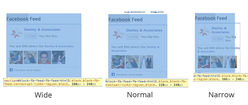
Instead of placing the Facebook Like Box code we will use jQuery to generate it for us on load, and then rebuild on page resize. Boom, problem solved due to data-width. Note: the Like Box will not shrink below 180px wide. Here's a preview while using Drupal and Omega Theme's responsive grid:
Now for the fun stuff, here are links to the Drupal module and GitHub Gist for the WordPress plugin.
- Responsive Facebook Like Box WordPress Plugin (widget)
- Responsive Facebook Like Box Drupal Module (block)
📘 Understanding Drupal: A Complete Guide to Caching Layers — my new book is out now!
Want more? Sign up for my weekly newsletter
